Pages

Saturday, 26 March 2011

The self portrait

This section asked for 5 sketches of my face from different angles. I'm always surprised when I first draw someone I know well, how ignorant I am of their features. Drawing a portrait makes you really look at someones face, like you have never looked before. This is also true when doing a self portrait. I guess most people don't scrutinise every single lump and bump normally so when you have to draw yourself it's actually quite interesting.


Then I was asked to draw 5 more sketches of the head only focusing on the shape of the head. When I actually spent a lot of time looking at the measurements of my face I got a much better likeness (bottom left).


After that do some sketches of the neck only which I initially thought was a strange request and I didn't think I would be able to draw a neck and make it look like a neck. In the end it was fine though.


The next task was to do 2 self portraits using a different medium and position for each.
I found that by the end of this section I was getting a pretty good likeness and it was much easier to do that on a larger scale but I struggled more with the likeness when drawing face sideon. I was pleased with the pencil drawing. This one looks like me the most but the eyes are a bit starey!


A3 Charcoal

A2 Pencil
Check and Log

1. Could you see the head and face as overall basic shapes? Yes once you looked closely you could see all the lumps and bumps which make the drawing a good likeness but overall the basic shapes are there first.

2. Does the head and face look solid and convincing in your drawing. Some more than others. I think in most of them they look solid due to shading and highlights.

3. Are there any assymetrical lines and angles on your face? Obviously the symmetry is lost when side on which is maybe why I struggled more with these ones. Overall I didn't notice much asymmetry when straight on which indicates I've not been totally perfect because noones face is symmetrical.I don't think I was looking for symmetry when I was drawing though. Because of shadows each side of the face is totally different from the other so I tended to focus on each individual part on its own.

4. Did you have any difficulty putting in the shadows? Yes I did have some difficulties getting the different tones correct and I think these subtle changes across the face are what gives a likeness. I found the most difficult part was getting the nose right when side on.I always have to sit back and look at the drawing and then make the darkest tones darker.

5. Did you readjust the size if the head? Yes I had to readjust the size of the face a lot because I would make the features too small. The forehead was always higher than I thought it would be.

Sunday, 20 March 2011

The Moving Figure

This section is more of a work in progress and involves me filling a sketchbook with fast sketches of the moving figure. In order to do this I've been taking every opportunity to sketch people. The instructions say I should carry a sketchbook whenever I go out and about. I gave this a go but found that it stayed firmly in my bag. I guess it's pretty impossible to expect to sketch outside when I'm permanantly attached to a newly crawling baby. I'm going back to work soon so I'll be a bit more independant although getting the time to sit and sketch might be the problem then!

Meanwhile I've made use of the people around me, the TV, magazines etc. Obviously photos and even images on the TV are easier than real life so I've tried to get as many real people in as possible.

Sitting in front of the TV and sketching people, I was pleasantly suprised at how interesting this can be. There is a never ending supply of interesting poses which in themselves can create pictures that tell a story. Someone simply standing, about to push open a door or reaching out to pick something up could make a great composition for a final piece. Where does the door lead to? What is the person reaching for etc etc? I've always struggled in the past to do this, with my figures ending up very static and boring. A little preparatory planning of positions would make all the difference to a picture.

I've found it quite challenging to draw these fleeting moments, which is the purpose of this section I suppose. Suddenly you spot an interesting pose and then the person moves and its gone. I'm learning quickly to accept a multitude of unfinished squiggles in my sketchbook and you have to just move on to the next squiggle. It does make me look out for the same pose next time if I spot one that's interesting. I've found myself asking people to stay still for a minute which kind of defeats the purpose but stops me getting stressed!

This is a bit of a deviation but one artist I really like that captures fleeting moments and makes the viewer wonder about the figure in the painting is Richard Whincop. I discovered him in a local gallery and fell in love with his paintings and was lucky enough to get one for my birthday a few years ago. To quote his website.......


"My oil paintings explore the relationship between people and artworks, and the way this is affected by the context in which they are seen. They include works inspired by the environment of Art Museums, which bring together people and objects from different cultural worlds. I have also depicted paintings or sculptures in unusual settings, or juxtaposed them with apparently unrelated objects. This approach can throw up dramatic contrasts or forge unlikely connections, with each element shedding new light on the other. I have explored the symbolic role of the picture frame as a gateway to another world, a fictional "artistic realm" that seems just as realistic as the real world. In these works I have depicted figures and objects apparently entering or emerging from framed paintings, suggesting two-way traffic between art and reality."

Consider Phlebas II, Oil on Board, 60 x 42.5cm


That Which We Seek, Oil on board, 44 x 60cm

To get back to the assignment though, I had a quick look at some sketches of moving figures on the internet. There's certainly a lot of sketches on the internet mostly from unknown artists. One artist that springs to mind is Degas. He is most well known for his paintings of ballerinas and galloping horses. He also did many pastel drawings of nudes bathing.
His ballerina paintings were the result of copious sketching to the point he was able to change the dancers positions in his final paintings only using his memory of the dancers complex postures. He also used photography.
Four Dancers, Charcoal


Ballet Dancer Standing, Conte crayon
He repeatedly drew the same pose until he mastered it. The sketches above show his corrections and how he would focus on one aspect to perfect it. He would have to make these sketches very quickly while the dancers where in position which wouldn't have been for long.

I recently visited a local gallery that had an couple of large scale drawings by Hazel Bowman. I was really impressed by these charcoal drawings of dancers. The artist has conveyed a sense of movement not only through the subject and the actual drawing but also I think though the positioning of the figures off centre. I studied the drawing, trying to figure out how she managed to catch the sense of movement. She has mainly left the ends of the limbs unfinished and in some places there are lines remaining where it seems as if she has started to draw but the model has moved. The charcoal is laid down following the twist of the torso or the clothes.

Hazel Bowman

So here are a few of my efforts anyway, I'll be working on this all the time........


Check and log

1.Did you manage to identify and to catch those fleeting moments? I hope so. I think the fleeting moments are conveyed in the positions of the limbs mostly. the rest of the body is fairly static. I think in some of my sketches, you can see the figures are in the process of doing something and they are just about to move. Even the seated figure above looks like he is unsettled and about to shift.

2. Did you find it difficult to retain the image and draw later? This is very difficult. I guess practice and experience will help this. The more you draw a particular pose the easier it will be to do from memory.

3. Were you able to keep to a few descriptive lines to suggest the movement of the person? This was also difficult but depended on how long I had to look at the figure. If it was a fleeting glimpse I was more economical with the lines. The tendency is to draw more than is needed. I think I need to find the key lines which would describe movement quickly. I think the arms and legs show movement and if you redraw without rubbing out then this shows a change in position.


Sunday, 13 February 2011

The Clothed Figure

This was a nice short section. The first task was to arrange some fabric and make two 15 minute drawings. Then i was to focus on small parts of the fabric in 5 minute sketches done in 15cm squares.
This was quite good fun. I love drawing the folds of fabric as I think they can, quite quickly and easily describe the underlying shapes as well as being interesting subjects in their own right. 
I'm quite pleased with my attempt and I can see how this could become a time consuming and highly pleasurable subject to paint and draw. Even for me, the most impatient artist, I could have spent ages doing this. As it was I had to drag myself away and I'm pretty sure I ran over time in my pencil drawing.
For my first drawing I wanted to give Lord Leighton's technique a go so I chose a coloured greyish sheet and a dark and light pastel pencil. The photograph hasn't shown the cream colour very well, in real life it's much lighter and represents the highlight a bit better.

Black and cream pastel pencil on pastel paper A4
 Then I drew the same fabric in my A4 sketchbook using soft pencil. I think graphite works quite well for this subject because it can be applied heavily for the darkest shadows and sharp edges or softly for the changing tones over the folds.

(right) Pencil on white paper A4   (left) upper - pencil, lower willow charocal A4
upper - compressed chacoal,      lower - conte pastel pencils  A4

Then I focused on parts of the fabric within 15cm squares. It didn't actually work out like I planned. I originally wanted to zoom in more and focus on a smaller section but each time I ended up drawing more than I wanted. The first two I used pencil and charcoal and the second two I used a compressed charcoal stick and then green and red pastel pencils. I thought the knot was interesting becasue it was all compressed. In hind sight however I would have zoomed in further and had less creases. 

While I was on this section I wanted to give Henry Moore's technique a go. I did a very quick copy of one of his shelter drawings using a white oil pastel overlayed with a wash of ink. If I tried it again I would apply the wax a bit harder but other than that it worked quite well. When you are putting the white crayon on the white paper you don't have much idea how its going to turn out so I was relieved when I put the ink on and it wasn't just a blob. It would be good to get some thinner crayons to get greater detail.


Oil pastel and india ink on watercolour paper A4


The final piece for this section draped some fabric over my husbands legs while he was sitting on the sofa. He had one leg half up on the sofa which has maybe confused it a bit. I spent about an hour on this and focused completely on the material of his top and the cover, leaving the head and arms very rough. The cover was a much stiffer fabric than his top and I think this has come across in the drawing.  

Final study, Pencil on paper A3
Elaborate depictions of clothes and fabric have been a constant feature in art throughout the ages. The grand portraits would had layers of luxurious satins and velvets which would show the wealth of the sitter. Artists must have spent huge amounts of time on painting clothes and drapery and I can see why.


Check and Log

Did you approach the figure as a whole? I'm not sure if I have. I concentrated on the fabric too much to the detriment of the whole figure. In fact I didn't even leave enough room for the feet.

Did you manage to create volume in the folds of fabric? I think the fold in the fabric can be seen due to the highlights and shadows.

Can you sense the figure beneath the fabric? Yes I think you can. It is possible to see the shape though the fabric, particularly the t-shirt which is softer material. The fabric draped over his legs was stiffer and didn't cling so much but I think it's still possible to see the shape of the legs and the bend at the knees.


Sunday, 6 February 2011

Clothed Figure - research

I wanted to look at some drawings of the clothed figure before I started this section. I had some artists in mind: Frederic Leighton; Henry Moore and Alison Watt.

Frederic Leighton


I went to an exhibition of his drawings and studies at the Hunterian Art Gallery a few years ago. I just happened to pop in and I wasn't aware of the artist before hand. However I was really impressed by these studies. They were so beautiful and so detailed, I was in awe of the work that went into them. My drawing tends to be very rushed and I'm too impatient to spend ages on tiny detail. Paradoxically though, I am most inspired by this type of drawing and painting.
In these studies for his large paintings he repeatedly concentrated on figures draped in yards of (seemingly) luxurious fabric. He predominantly used black and white chalk on coloured paper or graphite on white paper.


These studies above demonstrate the lengths to which he went to prepare for his paintings. He was known to carry out many preparatory sketches focusing on small areas of figures which he then traced onto his canvases. At first glance these drawings of drapery have an abstract quality but Leighton has skillfully described the curves of the underlying figure so that and on further inspection they are almost nudes.

He has used the brown paper as the main tone for the fabric and the black and white chalk serve to show the shadows and highlights respectively. This technique is so simple and yet so effective.

Henry Moore

I don't know an awful lot about Henry Moore but I happened to catch a programme about the drawings he did when he was sheltering in the London Underground tunnels during an air raid in WWII. As far as I can remember, he was stuck there one night and had to shelter so made use of his time by studying his fellow sufferers huddled together under blankets. He then made drawings from memory and would came back to London over and over for inspiration.


Many of his drawings were done using a "wax-resist" technique in which he drew with a wax crayon and laid washes of ink over the top. This technique works really well for the subject I think. You really get the feeling of a blanket draped over a sleeping figure. The wax is laid down where the highlights would be and then the other tones go on using watercolours or ink. I'd like to give this method a go.

Alison Watt

I was reading over the instructions for this section and we are asked to draw lots of squares in which we then draw close up areas of a piece of fabric, so in essence each one is a little composition in itself.


This made me think of the Scottish artist Alison Watt. A couple of years ago there was a BBC Artworks Scotland programme which documented her solo exhibition Phantom, at the National Gallery in London. Although they aren't drawings, her amazing abstract close-ups of fabric on a large scale are breathtaking in their beauty. Luckily there is one of her paintings in the Kelvingrove art gallery in Glasgow that I have been able to see.
Pulse oil on canvas 10 x 7ft


Phantom oil on canvas 213 x 335cm
Root oil on canvas
I love the way she has made such a simple subject so beautiful. She has obviously spent a lot of time considering the composition for each painting, each crease and each highlight are carefully thought out.
The link below on youtube shows some of her preparation for her NPG exhibition and is a great insight into how she works.The appears to have been influenced by Jaque Loius David and Jean Auguste Dominique Ingres and the way they painted fabric particularly the male fashion at the time, the neck-kerchief. She talks about negative space and her difficulties depicting this. This negative space is the focus of Root and Phantom shown above.

http://www.youtube.com/watch?v=z6GuM7g0IzE

Although these are oil paintings, because they are monochrome it is easy to see how they could translate to drawing using pencil or charcoal on white paper.


Saturday, 29 January 2011

Figures: Structure

Well I've finished the Structure section Assignment 2. I have to say I enjoyed this section a lot, possibly because I was able to get through it quite quickly without too many lengthy interruptions! 


I started off by studying some human anatomy from books and the Internet. Due to my background and studies I am very familiar with anatomy so felt quite confident with it. I did some sketches of the skeleton and muscles to remind myself.


I then set to the project, starting with a standing pose. I did a few sketches from different angles.


I wanted to include the back because the s-shape of the spine casts nice shadows, but I also wanted to see the face so I thought the best pose would be of the model twisting half round. This way there was some movement in the pose too, with the upper body rotating and the lower body rooted to the spot. I tried a couple of media. The first sketch was using pen, the second conte pastel pencils and the third and fourth were charcoal. I was surprised how difficult I found the pastel and charcoal at this size (A4). I decided to use pen and ink for this drawing. I had in my head a very simple ink drawing just showing the shadows and highlights but it didn't really work out like that. 

A3 nib pen and ink on 135g paper
Instead I found that the ink was very good at showing the shape of the figure. I could define the roundness of the muscles and show the imagined direction of the fibres. Unfortunately if I made a mistake with the direction though it really made a difference to the overall drawing. I'm pleased with the drawing but would like to give it another go with that knowledge. I also made a bit of a mess of the face, as usual! I really find it difficult to get faces right on this scale. I'm not so bad if they are portraits but when they are small, tiny changes make so much difference. Also I find it difficult to draw his beard without it looking like a shadow. 
  
Next, the sitting pose. I tried a few angles before I decided on my favourite. I wanted to use charcoal with this one. I think charcoal lends itself to drawing figures because you can soften the changes in tones by blending the charcoal.  


I used the sketches to help me choose a pose I liked with the light coming from the best direction to give optimal shadows. The first angle was more from the front and I really liked the foreshortening effect on the right thigh. The composition was nice as well, giving a pleasing triangular shape. However I thought it would be nice to include the back in the drawing. In hindsight I think this angle might have been a good choice although the one I opted for was also interesting. I tried some sketches from both sides but the view from the left gave a more open pose and showed the chest better. 

A3 charcoal on 135g paper

Because there was a mirror behind the model I had a lot of reflected light to put in, I'm not sure if this confused the final piece. I was excited about the way the models left leg came towards me and how I would make this work in the drawing. I think I managed this OK but maybe it would be better if there was some background in so the figure looked more grounded. I'm quite pleased with the shading over the legs especially the knees which I always find quite hard. Looking at it now, the stomach area should be a bit darker as should the neck. Yet again I hate the face although it looks slightly more like him than usual! 

For the next pose, I tried to spend less time on the sketches and focus on the overall shape giving indications of the underlying skeleton. I think this worked quite well. I tried a couple of angles which were more oblique but I felt they would be a bit simple for the main drawing although they were quite interesting. In the end I chose quite a classical pose. 

A3 graphite on paper


I misjudged the size of the paper so I left the feet out and I actually think this has worked well. In fact I'm really pleased with the legs which I spent only a short time on. I wish I could get this effect with the rest of the body! I'm pleased with the chest and neck on this drawing but now I see it the hands are far too small. I tried Seurat's technique of dark against light and I think its worked quite well. 


To answer the questions set in the brief:


  • Did you identify the central axis of the figure? If I understand this correctly, I think I have. In the standing pose, there is a line that goes down the back and right leg  the rest of the body seems to swivel round on this axis but the head is slightly too forward and lets the effect down. Its more difficult to define the central axis with the other poses so I'm not sure of the answer. However if this means the centre of gravity, then this passes down through the arm in both drawings. The head is placed directly above the elbow which carries the weight of the head (then through the leg in the case of the sitting pose in which the heel lies directly underneath again). 
  • Have you managed to achieve the overall proportions of the figure reasonably accurately? My biggest flaws in proportion are the hands in the lying pose and the head in the standing pose. Otherwise I think the proportions are OK.
  • Have you managed to convey the figure's structure and form? Yes I'm quite pleased with that. I think the pen and ink was helpful in shaping the musculature and the charcoal was useful for showing the gradual change in shading over the body.


Saturday, 22 January 2011

Seurat

Seurat is most well known for his large paintings using the technique of pointillism but his artistic genius is evident if you look at his drawings.

The Square House
According to MOMA, when they examined a number of his drawings, he used a technique of layering conte crayon with fixative applied to protect the initial layers. He would then use stumping to create lighter areas. He favoured a hand-made Michallet paper which is key to his unique style. He was able to adapt the application of conte to the surface of this paper to create the desired effect. For example, in his drawing The Square House he has taken advantage of the grid-like network of the paper to accentuate the lines of the house.
According to experts, rather than drawing using line, he would start by blackening more or less the page. He would then layer on further conte crayon to obtain his characteristic atmospheric half-shades.
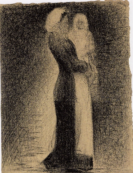
The Nurse
He would place an area of dense crayon next to an area of lightest application and this gives the impression of light. He called this technique “irradiation”. For example in the drawing the Nurse, the figure stands out clearly against the background even though they seem to be in shadow. He does this by leaving a halo of lighter paper adjacent to the dark edges of her dress while the edge of her apron is set against a dark background.This makes the figure jump out. He doesn’t use line to delineate figures, rather there is a difference in tones to show the shapes.

Madame Seurat
I was first introduced to these drawings while studying STP and I was blown away by the apparent simplicity of his technique. I’ve tried to copy the drawings but without being the proverbial bad workman, I really do think having the correct paper would help! I tried using different paper: normal cartridge, pastel paper, paper for acrylics and a handmade paper. I used conte pastel pencils, carre crayons and willow charcoal. I had a look for conte crayons but couldn’t find anything in sticks so I thought willow charcoal was probably the best option. I had a go at copying Seurat’s drawing of his mother “Madame Seurat” which I love.


I started out playing with the handmade paper but I found that it quickly began to disintegrate. I found the pigment showed all the imperfections in the paper which is also present in Seurat's drawings. The conte pastels were the best with this paper but because it was so friable I couldn't really use it.

Handmade paper
 
I tried copying Seurat's drawing on the other papers using willow charcoal. I found the best was the medium grain paper which was the pastel paper. The cartridge was just to smooth and the charcoal would smudge and then the effect was ruined. The course paper was interesting but just too grainy. In contrast to the cartridge, it wasn't possible to smudge this at all. Rather the pigment sat on the ridges only.
 Cartridge paper
 Pastel paper
Acrylic paper


So I was quite pleased with my experiment. I loved the effect these tools and his techniques achieved. It forced me to draw without lines and use tone only which is something I wouldn't do normally. Although his drawing look simple and like very little effort has gone in, once you have a go and look closely at them, you can see how skillfull he was and how he has thought about every stroke. I'll definitely try to draw in this style in future. 

Tuesday, 18 January 2011

Drawing 1: Figures - Structure

The previous sections of my course are in my logbook and sketchbooks but I thought I'd transfer to a blog halfway through. So here I am, at the the 2nd of 5 sections of the course. This one is Figure Drawing. I thought this section would be my favourite but I've actually found it quite frustrating. I think this is mostly because I have taken a year off to have my baby and only briefly looked at the course during that time. Anyway I'm trying to get into it again so hopefully practice makes perfect!
I've just finished the section about Form which I quite enjoyed when I got into it. Much better than the section about Gesture which was hard. I didn't enjoy the speediness of the sketches which is strange because I'm always struggling for time. The main problem was getting a recognisable human being in that time I think! It always takes me a few goes to get the proportions right and 2 minute sketches don't really allow for much detailed measuring.
So this section is Structure. I've read over it and it involves 3 main drawings, a standing, a sitting and a lying pose. Before I start I have to study the skeleton and muscle structure and make sketches etc. Then I should decide on the pose and do some sketches before I embark on he main drawings, each taking no more than an hour.
Ok so the 1st bit. To study the structure in books and make sketches. I have a degree in human anatomy so I should be better placed than most in this respect! I have to say I don't feel its ever really helped me when I'm doing figure drawing but maybe it has and I'm just not aware of it. I still manage to get all the proportions wrong! I guess I know the underlying muscle structure but unless you have a bodybuilder for a model its unlikely that you'll be able to see much! Luckily my husband is a long distance runner so has good muscle tone, especially in his legs. However he's not the most patient model and is fast running out of whatever patience he had.
I find thats been one of the hardest things in this chapter so far, getting a model for all of the sketches. I wonder how other people have managed. I'm lucky to live with someone and thus I've got a potential model there all the time (when he's in). Seems to be a bit difficult if you live on your own. I can't imagine a life drawing class would fit in with what the course requires all the time.
Right so I better go and do some sketching then! So much easier to sit here and blether!