Pages

Sunday, 6 February 2011

Clothed Figure - research

I wanted to look at some drawings of the clothed figure before I started this section. I had some artists in mind: Frederic Leighton; Henry Moore and Alison Watt.

Frederic Leighton


I went to an exhibition of his drawings and studies at the Hunterian Art Gallery a few years ago. I just happened to pop in and I wasn't aware of the artist before hand. However I was really impressed by these studies. They were so beautiful and so detailed, I was in awe of the work that went into them. My drawing tends to be very rushed and I'm too impatient to spend ages on tiny detail. Paradoxically though, I am most inspired by this type of drawing and painting.
In these studies for his large paintings he repeatedly concentrated on figures draped in yards of (seemingly) luxurious fabric. He predominantly used black and white chalk on coloured paper or graphite on white paper.


These studies above demonstrate the lengths to which he went to prepare for his paintings. He was known to carry out many preparatory sketches focusing on small areas of figures which he then traced onto his canvases. At first glance these drawings of drapery have an abstract quality but Leighton has skillfully described the curves of the underlying figure so that and on further inspection they are almost nudes.

He has used the brown paper as the main tone for the fabric and the black and white chalk serve to show the shadows and highlights respectively. This technique is so simple and yet so effective.

Henry Moore

I don't know an awful lot about Henry Moore but I happened to catch a programme about the drawings he did when he was sheltering in the London Underground tunnels during an air raid in WWII. As far as I can remember, he was stuck there one night and had to shelter so made use of his time by studying his fellow sufferers huddled together under blankets. He then made drawings from memory and would came back to London over and over for inspiration.


Many of his drawings were done using a "wax-resist" technique in which he drew with a wax crayon and laid washes of ink over the top. This technique works really well for the subject I think. You really get the feeling of a blanket draped over a sleeping figure. The wax is laid down where the highlights would be and then the other tones go on using watercolours or ink. I'd like to give this method a go.

Alison Watt

I was reading over the instructions for this section and we are asked to draw lots of squares in which we then draw close up areas of a piece of fabric, so in essence each one is a little composition in itself.


This made me think of the Scottish artist Alison Watt. A couple of years ago there was a BBC Artworks Scotland programme which documented her solo exhibition Phantom, at the National Gallery in London. Although they aren't drawings, her amazing abstract close-ups of fabric on a large scale are breathtaking in their beauty. Luckily there is one of her paintings in the Kelvingrove art gallery in Glasgow that I have been able to see.
Pulse oil on canvas 10 x 7ft


Phantom oil on canvas 213 x 335cm
Root oil on canvas
I love the way she has made such a simple subject so beautiful. She has obviously spent a lot of time considering the composition for each painting, each crease and each highlight are carefully thought out.
The link below on youtube shows some of her preparation for her NPG exhibition and is a great insight into how she works.The appears to have been influenced by Jaque Loius David and Jean Auguste Dominique Ingres and the way they painted fabric particularly the male fashion at the time, the neck-kerchief. She talks about negative space and her difficulties depicting this. This negative space is the focus of Root and Phantom shown above.

http://www.youtube.com/watch?v=z6GuM7g0IzE

Although these are oil paintings, because they are monochrome it is easy to see how they could translate to drawing using pencil or charcoal on white paper.


Saturday, 29 January 2011

Figures: Structure

Well I've finished the Structure section Assignment 2. I have to say I enjoyed this section a lot, possibly because I was able to get through it quite quickly without too many lengthy interruptions! 


I started off by studying some human anatomy from books and the Internet. Due to my background and studies I am very familiar with anatomy so felt quite confident with it. I did some sketches of the skeleton and muscles to remind myself.


I then set to the project, starting with a standing pose. I did a few sketches from different angles.


I wanted to include the back because the s-shape of the spine casts nice shadows, but I also wanted to see the face so I thought the best pose would be of the model twisting half round. This way there was some movement in the pose too, with the upper body rotating and the lower body rooted to the spot. I tried a couple of media. The first sketch was using pen, the second conte pastel pencils and the third and fourth were charcoal. I was surprised how difficult I found the pastel and charcoal at this size (A4). I decided to use pen and ink for this drawing. I had in my head a very simple ink drawing just showing the shadows and highlights but it didn't really work out like that. 

A3 nib pen and ink on 135g paper
Instead I found that the ink was very good at showing the shape of the figure. I could define the roundness of the muscles and show the imagined direction of the fibres. Unfortunately if I made a mistake with the direction though it really made a difference to the overall drawing. I'm pleased with the drawing but would like to give it another go with that knowledge. I also made a bit of a mess of the face, as usual! I really find it difficult to get faces right on this scale. I'm not so bad if they are portraits but when they are small, tiny changes make so much difference. Also I find it difficult to draw his beard without it looking like a shadow. 
  
Next, the sitting pose. I tried a few angles before I decided on my favourite. I wanted to use charcoal with this one. I think charcoal lends itself to drawing figures because you can soften the changes in tones by blending the charcoal.  


I used the sketches to help me choose a pose I liked with the light coming from the best direction to give optimal shadows. The first angle was more from the front and I really liked the foreshortening effect on the right thigh. The composition was nice as well, giving a pleasing triangular shape. However I thought it would be nice to include the back in the drawing. In hindsight I think this angle might have been a good choice although the one I opted for was also interesting. I tried some sketches from both sides but the view from the left gave a more open pose and showed the chest better. 

A3 charcoal on 135g paper

Because there was a mirror behind the model I had a lot of reflected light to put in, I'm not sure if this confused the final piece. I was excited about the way the models left leg came towards me and how I would make this work in the drawing. I think I managed this OK but maybe it would be better if there was some background in so the figure looked more grounded. I'm quite pleased with the shading over the legs especially the knees which I always find quite hard. Looking at it now, the stomach area should be a bit darker as should the neck. Yet again I hate the face although it looks slightly more like him than usual! 

For the next pose, I tried to spend less time on the sketches and focus on the overall shape giving indications of the underlying skeleton. I think this worked quite well. I tried a couple of angles which were more oblique but I felt they would be a bit simple for the main drawing although they were quite interesting. In the end I chose quite a classical pose. 

A3 graphite on paper


I misjudged the size of the paper so I left the feet out and I actually think this has worked well. In fact I'm really pleased with the legs which I spent only a short time on. I wish I could get this effect with the rest of the body! I'm pleased with the chest and neck on this drawing but now I see it the hands are far too small. I tried Seurat's technique of dark against light and I think its worked quite well. 


To answer the questions set in the brief:


  • Did you identify the central axis of the figure? If I understand this correctly, I think I have. In the standing pose, there is a line that goes down the back and right leg  the rest of the body seems to swivel round on this axis but the head is slightly too forward and lets the effect down. Its more difficult to define the central axis with the other poses so I'm not sure of the answer. However if this means the centre of gravity, then this passes down through the arm in both drawings. The head is placed directly above the elbow which carries the weight of the head (then through the leg in the case of the sitting pose in which the heel lies directly underneath again). 
  • Have you managed to achieve the overall proportions of the figure reasonably accurately? My biggest flaws in proportion are the hands in the lying pose and the head in the standing pose. Otherwise I think the proportions are OK.
  • Have you managed to convey the figure's structure and form? Yes I'm quite pleased with that. I think the pen and ink was helpful in shaping the musculature and the charcoal was useful for showing the gradual change in shading over the body.


Saturday, 22 January 2011

Seurat

Seurat is most well known for his large paintings using the technique of pointillism but his artistic genius is evident if you look at his drawings.

The Square House
According to MOMA, when they examined a number of his drawings, he used a technique of layering conte crayon with fixative applied to protect the initial layers. He would then use stumping to create lighter areas. He favoured a hand-made Michallet paper which is key to his unique style. He was able to adapt the application of conte to the surface of this paper to create the desired effect. For example, in his drawing The Square House he has taken advantage of the grid-like network of the paper to accentuate the lines of the house.
According to experts, rather than drawing using line, he would start by blackening more or less the page. He would then layer on further conte crayon to obtain his characteristic atmospheric half-shades.
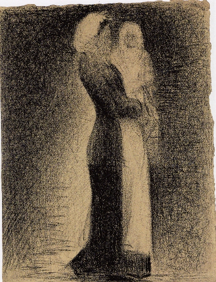
The Nurse
He would place an area of dense crayon next to an area of lightest application and this gives the impression of light. He called this technique “irradiation”. For example in the drawing the Nurse, the figure stands out clearly against the background even though they seem to be in shadow. He does this by leaving a halo of lighter paper adjacent to the dark edges of her dress while the edge of her apron is set against a dark background.This makes the figure jump out. He doesn’t use line to delineate figures, rather there is a difference in tones to show the shapes.

Madame Seurat
I was first introduced to these drawings while studying STP and I was blown away by the apparent simplicity of his technique. I’ve tried to copy the drawings but without being the proverbial bad workman, I really do think having the correct paper would help! I tried using different paper: normal cartridge, pastel paper, paper for acrylics and a handmade paper. I used conte pastel pencils, carre crayons and willow charcoal. I had a look for conte crayons but couldn’t find anything in sticks so I thought willow charcoal was probably the best option. I had a go at copying Seurat’s drawing of his mother “Madame Seurat” which I love.


I started out playing with the handmade paper but I found that it quickly began to disintegrate. I found the pigment showed all the imperfections in the paper which is also present in Seurat's drawings. The conte pastels were the best with this paper but because it was so friable I couldn't really use it.

Handmade paper
 
I tried copying Seurat's drawing on the other papers using willow charcoal. I found the best was the medium grain paper which was the pastel paper. The cartridge was just to smooth and the charcoal would smudge and then the effect was ruined. The course paper was interesting but just too grainy. In contrast to the cartridge, it wasn't possible to smudge this at all. Rather the pigment sat on the ridges only.
 Cartridge paper
 Pastel paper
Acrylic paper


So I was quite pleased with my experiment. I loved the effect these tools and his techniques achieved. It forced me to draw without lines and use tone only which is something I wouldn't do normally. Although his drawing look simple and like very little effort has gone in, once you have a go and look closely at them, you can see how skillfull he was and how he has thought about every stroke. I'll definitely try to draw in this style in future. 

Tuesday, 18 January 2011

Drawing 1: Figures - Structure

The previous sections of my course are in my logbook and sketchbooks but I thought I'd transfer to a blog halfway through. So here I am, at the the 2nd of 5 sections of the course. This one is Figure Drawing. I thought this section would be my favourite but I've actually found it quite frustrating. I think this is mostly because I have taken a year off to have my baby and only briefly looked at the course during that time. Anyway I'm trying to get into it again so hopefully practice makes perfect!
I've just finished the section about Form which I quite enjoyed when I got into it. Much better than the section about Gesture which was hard. I didn't enjoy the speediness of the sketches which is strange because I'm always struggling for time. The main problem was getting a recognisable human being in that time I think! It always takes me a few goes to get the proportions right and 2 minute sketches don't really allow for much detailed measuring.
So this section is Structure. I've read over it and it involves 3 main drawings, a standing, a sitting and a lying pose. Before I start I have to study the skeleton and muscle structure and make sketches etc. Then I should decide on the pose and do some sketches before I embark on he main drawings, each taking no more than an hour.
Ok so the 1st bit. To study the structure in books and make sketches. I have a degree in human anatomy so I should be better placed than most in this respect! I have to say I don't feel its ever really helped me when I'm doing figure drawing but maybe it has and I'm just not aware of it. I still manage to get all the proportions wrong! I guess I know the underlying muscle structure but unless you have a bodybuilder for a model its unlikely that you'll be able to see much! Luckily my husband is a long distance runner so has good muscle tone, especially in his legs. However he's not the most patient model and is fast running out of whatever patience he had.
I find thats been one of the hardest things in this chapter so far, getting a model for all of the sketches. I wonder how other people have managed. I'm lucky to live with someone and thus I've got a potential model there all the time (when he's in). Seems to be a bit difficult if you live on your own. I can't imagine a life drawing class would fit in with what the course requires all the time.
Right so I better go and do some sketching then! So much easier to sit here and blether!

Thursday, 2 December 2010

Research - Jenny Saville and Paula Rego

At the end of Assignment 1, my tutor suggested that I looked at the work of Jenny Saville and Paula Rego before the drawing figures section. Luckily, I was familiar with both of these artists as I love their styles.

Jenny Saville

Jenny Saville studied at Glasgow School of Art, which is one of the reasons I was familiar with her before. Interestingly though I've never come across any of her work in the museums and galleries in the area.

Her huge figure paintings are at times grotesque and shocking. Apparently she started her fascination with the larger female body while on a scholarship at Cincinnati. She was ‘interested in the malls, where you saw lots of big women. Big white flesh in shorts and T-shirts. It was good to see because they had the physicality that I was interested in.’ She later worked in New York where she was able to observe the practise of a plastic surgeon and was part of the famous Sensations exhibition Royal Academy of Art in 1997 alongside Tracey Emin and Damien Hirst to name but a few.

Her style is often compared to Lucian Freud, and like him she doesn't depict the human form in a falsely beautiful way, rather she exaggerates every lump and bump. She works from images rather than models giving her larger than life size figures exaggerated pigmentation and distorted mass. She paints not only extremes in size but also deformities and patients undergoing surgery. 

Branded 1992, 7' X 6'

Strategy(south face front face north face) 1993-4 274x640cm

Propped 1992 213.5 x 183cm

The way she describes the flesh with the paint is amazing, I would love to see these paintings in real life to see the texture.

What can I take from these paintings......they way she exaggerates body parts for effect is very interesting. In "Propped" above she has exaggerated the perspective by making the figures knees much bigger. She has a message in her paintings. These are not just beautiful nudes painted for decoration and the pleasure of the viewer. These paintings are done in such a way to make the viewer think about what they are looking at. These women are painted in an unromantic and realist way. This is life and its not glamorous. I think she's challenging the viewer to question what they think as "normal". If a child with a birthmark is seen as shocking then there is surely something wrong with our society and our perceptions of normal.

Red Stare Head IV, 2006-2011 252 x 187.5 cm
She also has a number of drawings. She draws each figure multiple times erasing and superimposing them on each other. She leaves the changes visible making them part of the drawing. This results in very dynamic drawings which in the case of her series inspired by Leonardo's cartoons, play on the static Renaissance nativity images that they are based on.

Reproduction Drawing IV after the Leonardo cartoon 2010
Self
Time II 2010

Paula Rego

Rego was born in Portugal, cared for by her Grandmother for a large part of her childhood until she moved to the UK to be with her parents.  Her grandmother taught her many of the traditional folktales that she based much of her future art work on. She studied at the Slade School of Fine Art from 1952-6.

She is most well known for her pastels, paintings and prints often depicting folk tales.


Snow White Playing with her Father's Trophies 1995 pastel 178x150cm

Dog Woman 1994 Pastel on canvas 120 x 160 cm
 
Dancing ostriches 1995 162 x 155cm Pastel on paper mounted on aluminium

Dancing ostriches 1995 Pastel on paper mounted on aluminium 150x150cm
These pastels are fantastic. I actually thought that they were oils before I studied them. The highlights on the limbs are lovely and like Degas she has used a directional hatching technique. Her figures are strongly described and quite clearly delineated to the point where there is a black line round some of her dancers. Her style is very different from that of Jenny Saville who sculpts flesh with the paint. Rego's flesh seems quite smooth. Like Saville though, Rego exaggerates the forms. The heads and features in particular seem quite distorted. The women are all very masculine and muscly even the usually dainty ballet dancers.
Unlike Degas, her technique with pastels seems more blended, at least the underneath layers. There is no ground showing through giving a very finished look to the pieces. "Dog woman" looks less refined that the others, much looser, possibly because of the surface as this was done on canvas which must give a bumpy texture for pastels and would make it difficult to give that clean blended look.

She has done many etchings and is known as a printmaker.     

Drawing for 'The Dance' 1988 pen and ink 296x421mm
Flood 1996 etching and aquatint on paper 395x335mm
The Tate website has this to say about her drawings....."Pen and ink drawing on machine-made white cartridge paper......The images have been drawn in pen and brush, with ink washes of mainly one or two shades of brown and a few splashes of diluted black in the sky and shadows. The support is slightly buckled where the ink washes have been applied."


Wednesday, 1 December 2010

Tutor feedback - Assignment 1


Assignment 1 was before I started this blog and before my year off to have Lily. My tutor at this time suggested that I looked at my drawing below and how it was placed on the paper, leaving a large area on the right empty. This drawing was done to demonstrate texture.

A3 bamboo pen and ink

Looking through my pictures, this was a constant problem when I started the course. I never seemed to plan where-about on the paper the image would be and the objects would invariable fall off one side. I think this is something I have improved and also I have learned to cover the paper more, rather than leaving a big white border round the objects.

Looking at the drawing above I decided the composition simply needed a darker area on the left to make it  more balanced. Although the shadows were going the other direction, I though I could get away with some shadow-like areas under the objects. I used ink and a sable brush but felt this was too "soft" so I increased the texture and tone using charcoal.


I felt the composition needed something else as it was still lop-sided so I cropped the top and bottom and right side. It's still not perfect and the glove is too close to the left edge but it's certainly better than it was.


Approx A4 bamboo pen, ink and charcoal


I found this exercise really quite stressful as I was sure I was going to ruin the drawing but my first attempt worked out OK and this gave me some confidence.

My tutor also commented on some other drawings...


"...The two items in this simple still life form an independent whole, which along with the huge double shadow and sharply observed reflected shapes, suggest a single cohesive form. The slightly eccentric composition works fairly well here; but I can't help wondering what difference, some reference to the negative area in the extreme top right of this composition, would have made to the atmosphere, balance and dynamic of the image? (This may also apply to the second reflections image of the cans)"

I can completely see what he is saying looking at the drawing.

Original A2 charcoal and white conte

Again, my heart was in my mouth when I had to change it though. I didn't really know what to do. After much deliberation I decided to place the objects on a mat or something and give the drawing a bit of distance in the top right by putting a doorway or something.


Changed A2 charcoal + conte

I then did the same with the other drawing he mentioned.

Original A2 charcoal and conte
Changed A2 charcoal and conte

It took all of 10 minutes to do both drawings and I think its improved them a lot.  

Funnily enough looking at them on the screen, I think the second drawing of the can has come out better but at the time I was sure I had ruined it. For both drawings the strong shadow complicated things a bit and I was scared the long shadow of the can would look odd because I've given the objects an upright background at the back which would change the angle of the shadow. I think it's OK though and isn't too obvious.

Natural Forms

For this section I had done a pencil drawing of some vegetables.

A2 pencil


My tutor complimented me on this drawing but commented if I had thought to experiment with the conventional tonal and textural marks with those I'd discovered in the earlier mark making exercises. This is an interesting point that I had trouble answering initially. I think I find these more expressive marks more unnatural to use in an actual drawing. It just doesn't occur to me to use them. Looking at the changes I made to the charcoal drawings above, these marks seem more expressive and less laboured so I hope I have learned to incorporate them into my repertoire. 

He also commented on the huge amount of empty space in my drawing - again. It seems so obvious to me now but at the time I felt this was the way to draw without detracting from the objects. I see now that although my page is A2 the drawing is only taking up an A3 size. This is a shame because I actually enjoy the larger scale. He suggested that a cropped version of the drawing would be better, even to the point of zooming into the centre of the vegetables like this...


This is really interesting and daring but I just feel something is wrong with this compositionally. I can't quite put my finger on it. I love these large scale close up paintings of flowers and fruit etc that seemed to be very popular a few years ago but in this instance I think there's not enough white. The tones seem too dark and complicated or something. I'm also too much of a coward to cut so much away from the drawing!

The other alternative was more traditional (and easier) and just involved cutting off the extra white area that I didn't fill.


Looking back at the original, it's clearly better compositionally. After chopping bits off the first drawing of the glove, I realised that doing this means there's not enough paper left to attach to a mount for framing so this leaves me in a quandary. Do I crop it tightly for the purposes of assessment or do I leave a bit of edging so that I can mount it at a later date? Indeed should I attach a mount for assessment? I'm not sure you can even do this. Something I have to think about. At this stage I'm not sure it's even going in for assessment!

Man-made Objects

My tutor was a bit happier with my placement of this drawing on the paper! It takes up nearly all the paper but as with my others it's still lacking background.

Original A2 Pen and ink

I was so reluctant to change it as I liked it, even though I could see it needed something. This was the most difficult yet! Anyway, I gritted my teeth and gave it a go...

Changed A2 pen and ink

I placed the objects on a table with a mat to add interest. Then I was left with the pure white background which looked too artificial. Rather than put anything too complicated, I put a light wash. I used vertical brush strokes to do this to create a difference from the horizontal strokes of the table. This also gives the impression of curtains (I hope).

This was difficult, but the end result is a finished drawing that can be hung on the wall rather than a study of objects floating on paper. I'm happy with it and glad I had enough courage to make these additions.