Pages

Saturday 21 April 2012

Tutor feedback - Assignment 5

Assignment 5 - Tutor feedback

I had great feedback for this assignment. Here is some of what she said...


"The final drawings are wonderful and beautifully drawn. Your own comments in your blog explain that the thinking and consideration behind your decisions is all well thought out. I don’t need to add anything.
The sitting crouching pose = Only one change: perhaps to try to get rid of the white highlighting line along the shoulder. The highlight works really well, and is well though out, especially with the darker opposite side. Can you merge the line into the shading so it doesn’t look like a line.
The foreshortened pose = just the same comment for the dark line on the right hand side along his trousers."


I wasn't sure what my tutor was referring too so I emailed for confirmation and she she replied...


Can you see the definite line edging the right hand - his left one. - shoulder? It was really observant and advanced of you to emphasise this darker edge by lightening the back ground, but i just want to ensure you've done this as well as you can.
You need to merge your marks. That's all.

I immediately saw what she was talking about so I tried to blend it in and make the line less obvious.


 For the second drawing I did a bit more and had to stop myself from making more changes when I started! 

A2 Original Pastel
Changed A2 pastel

I got rid of the dark line along his right trouser leg but I felt it still needed some darkening so I introduced a bit of the reddish brown I'd used in other parts. The cover looked a bit odd so I tried to make it look like his weight was pushing it down. I also added some of the red into the shadows on his face and arms as they had become over blended and needed something to freshen them up a bit. Overall not too many changes.
 

I was really happy that my tutor likes this assignment as I had put a lot of work into it. I also received blog of the week from the OCA. The piece said that my blog was laid out well and easy to navigate through for tutors. I'm so glad because it's something I've spent some thought on. When I set the blog up I was quite frustrated with the limitations set by the application. I felt the time line wasn't very understandable for this course so I'm glad I've managed to make it easier to navigate through.
  

Tutor Feedback - Assignment 4

Assignment 4 - Tutor feedback

From assignment 4 my tutor gave me some good advice....


"A hint to help you with your next work Try to get into the habit off varying the lines as you sketch. Use those initial lines to show light and dark sides and tones. E.g. draw heavy lines on one side of the house, and the lightest hint of a line on the opposite side, then, in two lines you have made a note of tone, light, surface and shading for later. Try some experiments to note as much as you can in as few lines........you can vary the strength of the line , including density, and width to show tone."

I've actually been told this before in my local art class but I always forget to adhere to it. I had been drawing a plant and she had suggested that I tired varying the heaviness of the line round leaves etc. It struck me then as a good idea but I immediately forgot. I find it difficult to remember to do these things when I get immersed in a drawing, I guess the more you hear them though the more likely you will remember. 

I did a couple of experiments using this method........ 


My tutor also gave me some suggestions for my line drawing of the townscape.

Before changes A3 Bockingford paper

I think I've taken the instruction "line" a bit too literally. My first attempt at this section had been too much of a tonal drawing but this attempt maybe needed a bit more than just outline. I need to try and get something in the middle.  My tutor has recommended....

"The blanket shading of the windows could be varied to show light touching the glass. You can show the direction of the light one the recess by heavy lines on one side of the pane and lighter or broken or just suggestions of lines, on the other. The walls can show texture with a few stony lines on what would be shaded areas. Some houses will shade others and this can be shown with only a few well placed lines."
  
I've tried to follow these suggestions and I think the changes have improved the drawing. Rather than an outline exercise it's more interesting and has more texture. Making the top and side of the windows darker has made a huge difference to the sense of depth in the drawing. I wouldn't have believed it until I compared the before and after photos. I'm so surprised at the difference that such a simple and obvious thing makes I don't think I'll forget to do this now!


Here's a zoom in of part of the drawing showing how I've indicated brickwork on the houses and increased the tone one the top and left of the windows and tried to indicate the glass by making diagonal hatching.


 Looking at the drawing now I should have made the outlines of the mountains much lighter. This would have demonstrated the distance. I wish I could lighten then a bit. I may try to experiment with white pencil or something!

Development of a Sketchbook townscape

My tutor had this to say....
 
"Your development of a sketchbook townscape is planned well. You have suggested light, solidity and many other factors well.  The building is tonally finished and the remainder could match in quality with just a few strokes.
 Try some rubbed out streaks to lighten the side of the tree tonally, and give perspective and solidity. A well used rubber ( not rubbing out, but lightening the tone,) can give more variations to the branches too. If this is a whole piece for submission a well executed drawing should cover the whole page, so bring the detail to the front rather than scattered around as suggestions. Then it will be fine."

Original A4 pencil on paper
 I had struggled a lot with the tree in the background but this was before I had done the section on trees so I felt a bit more confidence looking at it again. Unfortunately I has sprayed the drawing with fixative so it was difficult to lighten up the tree but I did a bit. I also tried to fix the branches a bit. The original was very dark and I had obviously randomly laid down squiggles hoping it would look like branches. I think I was overwhelmed with the enormity of the job trying to draw every tiny branch and tried to rush it. Having completed the section on drawing trees I realise that you can't rush it and you have to study how the branches intertwine. I think it I had at spent a bit more time at least on the front most branches I could have indicated the furthest away ones more quickly. 

Anyway I tried to lighten the trunk and fix the branches a bit. I also added in the detail at the front. I had a look at some pictures of grassy areas and realised the differences in tones you can get in an area such as a lawn or park, even if it is cut short. As this was a graveyard the ground was naturally quite bumpy so I tried to show this with some shading and picking out the detail in the grass. 

I also added a kerb to the path. I don't think there was one but it added some detail. I pleased with the changed, they've improved the drawing.

Changed A4 pencil on paper
 Drawing Trees

I didn't have much to do for this section. My tutor suggested that I looked at the grass in my individual tree....


"Your individual tree is glorious. Do ensure that the grass matches in quality.
Your collection of trees is lovely. No tweaking at all."

Original A3 pencil on paper
I saw immediately where I had rushed my finish and just made some scribbly marks to show the foreground. Again my impatience to finish a drawing is the problem. I had a go at putting some more detail in the grass and drew in a small tree (not sure if this detracts). The detail makes the drawing seems more finished and complete.

Changed A3 pencil on paper


Wednesday 4 April 2012

Degas at the Burrell Collection

I've visited the Burrell Collection in Glasgow many times but today I went with an interest in Degas' pastels. Following my last assignment done in pastels I have a new found interest in the medium and I wanted to have another look at his drawings. It was very interesting and seeing them in person allowed me to study his technique much better than from the pictures on the Internet. I've seen these drawings before but I was able to take a lot more from them this time.

The main thing I noticed was the way he layered his pastels on top of each other but still allowing the colour of the ground to shine through.

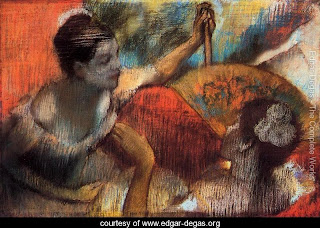
Degas - Dancers in a Box 1884

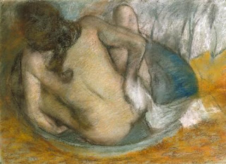
Degas - Woman in her bath 1884

He applies the pastels in a very directional way, with different areas having different direction of strokes. In "Dancers in a Box" the bright orange and the highlights on the figures are laid down in horizontal hatching and I noticed he would often have a different colour underneath with the opposite stroke direction. He wouldn't use this hatching on all parts of a drawing though. The pinky highlights on the shoulders and left arm of the figure in "Woman in her Bath" are much more natural. They seem to be applied in a rounder motion but still allow the darker colour underneath to shine through. None of his marks appear to be blended very much, they still have a new, unpolluted feel to them.

In "Woman in her Bath" it is possible to see pentimenti where he has made changes to the woman's arms and legs. He hasn't made much effort to hide these changes which is interesting in itself. It's as if he has left them so they become part of the drawing suggesting movement and change.

There was an unfinished drawing there, "Woman at her Toilette" c1897 (I wasn't able to find an image of this) which demonstrated how Degas started a drawing. Unusually, this drawing was done on a canvas rather than paper, possibly this is why he didn't complete it. His method was to draw the outline of the figure in with charcoal first and then to block in the areas of colour with broad strokes.

Degas - The Green Dress c. 1897-1901
45 x 37 cm

The other interesting thing that I found out was that Degas would draw on tracing paper and then stick this to board, as in "The Green Dress". From what I can find out, it seems he would frequently use tracing paper possibly to combine elements of different drawings to make new compositions.

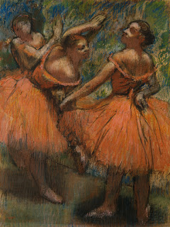
The drawing that impressed me most was his beautiful drawing " The Red Ballet Skirts". The reason for this was the colour of the skirts. Rather than a red though is was more and orangey pink. Nonetheless it was vibrant and striking unfortunately this reproduction cannot convey. The colour had been laid down in vertical strokes. I think it was this top layer of unblended pastel that gave the drawing its brilliance.

Edgar Degas - The Red Ballet Skirts  1895-1901 Pastel on tracing paper 81.3 x 62.2 cm
Looking at this drawing, there's not much too it. He hasn't spent ages describing tiny details. Rather it is the accurately placed quick strokes and his choice of colours that convey the flesh  and the texture of the figures and their dresses.

Degas strikes me as a very sensible person, not afraid to use aid like photography and tracing paper that other artists would possibly see as cheats, in order to use his time and media to its best advantage. He seems to be economical with his technique as if he was eager to try new things out and always thinking about the next drawing or step in his development as an artist.